
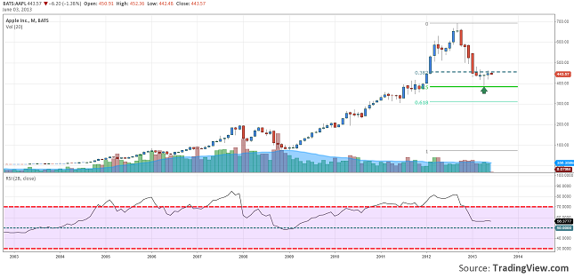
Chart: AAPL, Monthly
We took a look over the Monthly chart of Apple Inc. some time ago and wanted to share with you this fantastic view.
The price of Apple’s share dropped from almost 700$ to 400$ where it found also the 50% retrace from the preceding up trend. Right at this round number we can see that the price has drawn a Hammer type candlestick pattern, after which a consolidation started. If the price will break 463$/share then it might rally to 500.00 or even farther to 550$ per share.
Don’t take your eyes off the 400.00 support level, because a close under it might target lower levels like 350 or 300 dollars per share.
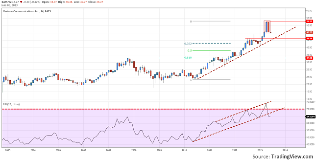
Chart: VZ, Monthly
The next chart we found pretty interesting was Verizon. As we can see it had a pretty nice up trend. The price got up to 54$ per share and the 28 months RSI went overbought.
But we all know that what goes up must come down at some point. The bearish signals started to appear. The price action signals a reversal from the Bearish Engulfing made right at the high of the trend. It is also in the same direction with the RSI which dropped under the 70 level.
Now if these signals are correct we can expect a drop back to the trend line where it will also find a good support at 45$ per share. A drop under this area would be scary because it would probably move lower to 40 bucks per share or even 35.50.
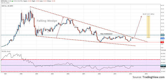
Chart: DELL, Monthly
Now this chart is pretty awesome. If you did not look over a monthly chart of Dell, you should do it now.
The price of Dell’s shares has fallen to 8$. The buyers definitely tried to bring the price up, but they have found themselves blocked at a key resistance of 18$ per share. After another dip the price seem to be heading again to this level.
The most interesting part is that now it has encounter the down trend line earlier. And it is not only a trend line; it is also the upper line of the Falling Wedge that was started 13 years ago. So if this line will be broken then the buyers might have a better chance in breaking the resistance. If this will happen…well just imagine a possibility of a 215% up trend to the target of the pattern.
We are eager to find out you opinion about these chart, so please share it with us. Or if you have seen other charts, you can also share it with us and all our readers.
3 Interesting Stock Charts You might Want to Look Over by Razvan Mihai